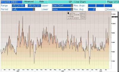
Below is a chart of the S&P 500 SPDR ETF, ticker SPY (I have used the SPY as a general proxy for the trend in volume although there might be slight differences to actual exchange volume). The top section of the chart is the SPY price movement and the bottom of the chart is the SPY volume. When the market is down the volume bar is red, and when the market is up the volume bar is green. During the up-trend in March and April you will notice red volume bars spiking higher than the green bars indicating that volume was much stronger on down days then it was on up days. This volume pattern would seem to question the bull market as more investors were eager to sell on down days than buy on up days. Or put another way, volume did not confirm the trend.
After the April 23rd high, you can see that the red volume bars at the bottom still stick out higher than the green bars, with significant peaks during the May 6th “flash crash.” At this point volume is now confirming the short-term trend as volume increases on down days and decreases on up days. This is only one look at the market but I would like to see the volume pattern change, and provide some rocket fuel for what may be the last leg of this cyclical bull. Until then I would remain skeptical of the rallies.


