In a June 23rd Op-Ed in the Financial Times, Chinese Premier Wen Jiabao attempted to boost global confidence in China’s economy, boasting about their “steady and fast growth” and their “flexible and prudent economic policies.” We wish we shared Premier Wen’s conviction.
Recent data suggests that China’s economy has actually been slowing noticeably of late, along with many other global economies. This is welcome news in China, however, as they’ve been applying the brakes for the better part of the past year in response to a red-hot real estate market and steadily increasing inflation. The hope is that they haven’t gone too far and risked a major downturn.
China’s ability to achieve the proverbial soft landing is more critical than ever, since developments closer to home aren’t terribly encouraging. U.S. monetary policy is about to become less accommodative (QE2 ends today), and however the debt ceiling stalemate turns out, I think it’s safe to assume that fiscal policy is about to become less supportive, too. Meanwhile, Europe is desperately battling their debt crisis, and Japan is still trying to recover from the devastating earthquake. In other words, the global economic recovery appears to be approaching a perilous spot.
It may be wishful thinking, but if China is able to thread the needle and successfully quelch inflation without sinking their economy, which is a tricky thing to do, it would provide a huge lift to a world economy that is still struggling to find solid footing two years after the last recession ended. Let’s hope that Premier Wen's confidence isn't misplaced.
Thursday, June 30, 2011
Wednesday, June 29, 2011
New Holding - U.S. Dollar Index Fund
Rick Vollaro wrote a brief article detailing the reasons why we recently purchased a new fund that tracks the value of the trade-weighted U.S. dollar index in most of our client portfolios.
Please click here to read Rick's article, which is posted over on the main Pinnacle website.
Please click here to read Rick's article, which is posted over on the main Pinnacle website.
Monday, June 27, 2011
PIIGS – The Problem is 17 vs. 1
17 different member states of the European Union share a currency called the Euro, and have their monetary policy set by one central bank, the European Central Bank (ECB). Over the last year the rolling problems in Portugal, Ireland, Italy, Greece, and Spain (the so-called PIIGS) have helped demonstrate the fundamental problem of having 17 different countries that are forced to live with one currency and monetary policy setting.
The major problem I have with the structure of the Euro currency and ECB is that it’s trying to serve too many masters. A strong currency and tightening monetary policy might suit the stronger members of this union just fine (like Germany). But how is that same stance working out for any of the PIIGS countries that have very poor growth rates, too much debt, and need to foster growth far worse than they need price stability and a strong Euro? The answer, according to the credit markets, is that it’s not. The options the PIIGS are missing right now are to lower interest rates and drastically devalue their currencies in an attempt to reflate their economies. Those are options or tools that they had before they adopted the Euro and were governed by the ECB.
Currently everyone is caught up with Greece and whether it will default. It appears that the recent vote of confidence may buy them some more time. However, I don’t think folks are really stepping back and asking the bigger question here. The issue is whether or not so many diverse countries, with different growth rates and economic circumstances, should be bound by one currency and monetary policy setting. The market has showed us for over a year why it doesn’t make sense. You have to wonder how long it will take for these countries to figure that the best answer for them is to stop participating in this poorly structured system.

Friday, June 24, 2011
10-Year Normalized P/E Ratio (Part 3 of 3)
Even though picking and choosing which data points to consider and which to ignore may be considered borderline to manufacturing data, it is often common practice to assume an equal percentile of data points at the top and bottom of a sample to be outliers, i.e. anomalies, not representative of the true distribution of the variable. Consistent with this assumption, such data points are thrown out of the sample. In Figure 3 (shown below) we experiment with the 5th and 95th percentiles of the sample. This definition of outliers causes the range to be bounded between 9.57 (5th percentile) and 30.23 (95th percentile). Consequently, the whole 2000 tech bubble, as well as some of the lowest values recorded during the depressions of the 1920s and 1930s, are ignored.
This approach implicitly assumes that all the relevant information that can be extrapolated from the P/E 10 has to do with its relative position within the 5th-95th percentile range, and that any values outside of this range do not provide any additional information. For instance, if the P/E 10 decreases from 15 to 10, this may be considered a move from undervaluation to extreme undervaluation. However, if the P/E 10 decreases further from 10 to 5, the market will simply remain extremely undervalued.
Perhaps the most important effect of capping a distribution at given percentiles and eliminating outliers is the one of bringing the average, median and mid-range of the capped distribution closer to each other. In our example, the median of the capped P/E 10 distribution remained the same at 15.85, and so did the percentile of the most recent reading of 25.90. However, the average decreased from 18.06 to 17.69 and the mid-range decreased from 26.70 to 19.90. In this framework, the most recent P/E 10 of 25.90 is still 63.45% above its historical median of 15.85 and still ranks at about the 90th percentile of the historical sample. However, the same P/E 10 now appears slightly more overvalued when compared to the average (from 43.40% overvalued to 46.38% overvalued) and 30.17% overvalued when compared to its mid-range (from 2.99% undervalued).
We can therefore conclude that, when we contemplate the presence of a certain degree of outliers in the historical distribution, the current level of the P/E 10 indicates a consistent high level of overvaluation regardless of whether it is compared to its long-term average, median, ranking, or mid-range.
![]()
This approach implicitly assumes that all the relevant information that can be extrapolated from the P/E 10 has to do with its relative position within the 5th-95th percentile range, and that any values outside of this range do not provide any additional information. For instance, if the P/E 10 decreases from 15 to 10, this may be considered a move from undervaluation to extreme undervaluation. However, if the P/E 10 decreases further from 10 to 5, the market will simply remain extremely undervalued.
Perhaps the most important effect of capping a distribution at given percentiles and eliminating outliers is the one of bringing the average, median and mid-range of the capped distribution closer to each other. In our example, the median of the capped P/E 10 distribution remained the same at 15.85, and so did the percentile of the most recent reading of 25.90. However, the average decreased from 18.06 to 17.69 and the mid-range decreased from 26.70 to 19.90. In this framework, the most recent P/E 10 of 25.90 is still 63.45% above its historical median of 15.85 and still ranks at about the 90th percentile of the historical sample. However, the same P/E 10 now appears slightly more overvalued when compared to the average (from 43.40% overvalued to 46.38% overvalued) and 30.17% overvalued when compared to its mid-range (from 2.99% undervalued).
We can therefore conclude that, when we contemplate the presence of a certain degree of outliers in the historical distribution, the current level of the P/E 10 indicates a consistent high level of overvaluation regardless of whether it is compared to its long-term average, median, ranking, or mid-range.

Thursday, June 23, 2011
10-Year Normalized P/E Ratio (Part 2 of 3)
At any given point in time, figuring out how to interpret the P/E 10 may not be as straightforward as it seems. Figure 2 (below) plots the P/E 10 for the S&P 500 since 1880 to date. If we consider the historical average equal to 18.06 to be a normal or fair value for the P/E 10, then the most recent reading of 25.90 would indicate a 43.40% overvaluation. If instead we were to use the historical median, currently equal to 15.85, the S&P 500 would appear to be 63.45% overvalued. Alternatively, if we wanted to consider how the most recent reading of 25.90 ranked within the historical sample, we would find that it corresponds approximately to the 90th percentile, where anything above the 50th percentile would be considered overvalued territory. Therefore, depending on whether we use the average, the median, or the percentile ranking, currently the S&P 500 would appear to be between 40% and 63.45% overvalued.
Notwithstanding a sizeable difference between these two numbers, certainly neither of them bode well for buy and hold investors entering the market at this point. However, this is only one way of looking at the problem. If we instead focused on the historical range of the P/E 10, we would notice that historically the P/E 10 was as low as 4.46 and as high as 48.94. The implied mid-range is 26.70, which is approximately 3% greater than 25.90, the most recent reading. Therefore, using this approach, currently the market would appear to be slightly undervalued.
The cause of the large discrepancy in the conclusions reached by the different methodologies is not a mystery: Figure 2 clearly shows that during the 2000 tech bubble the P/E 10 inflated to never-before-seen levels. If this once-in-a-century event is ignored, then the upper bound of the historical range would have been below 35, implying a mid-range of approximately 20 and consequently some degree of overvaluation in the most recent reading of 25.90.

Tuesday, June 21, 2011
10-Year Normalized P/E Ratio (Part 1 of 3)
The 10-Year Normalized Price-to-Earnings ratio, commonly known as P/E 10, was originally introduced by Professor Robert Shiller in his ground-breaking book Irrational Exuberance [Princeton University Press 2000, Broadway Books 2001, 2nd ed., 2005]. The database used in the book is regularly updated and made publicly available on Professor Shiller’s website (www.econ.yale.edu/~shiller/).
In its simplest version, the ratio is calculated dividing the price of a security (usually a market index such as the S&P 500) by the 10-year average of its trailing-four-quarter earnings per share. The rationale behind this metric is twofold: to obtain a valuation measure that is purely historical (i.e. ignoring any analysts’ estimates of future earnings, which could be biased) and to adjust for the cyclicality in earnings. Figure 1 (below) illustrates how the 10-year average smoothes out earnings volatility, portraying a clearer picture of the long-term trend in earnings.
It is fairly easy to illustrate the power of the P/E 10. For example, using Professor Shiller’s database, we calculated the average five-year annualized S&P 500 return following a P/E 10 lower than 11.16 (the historical 10th percentile) as well as following a P/E greater than 25.38 (the historical 90th percentile). The former is equal to 10.54%, while the latter is equal to 1.13%. Moreover, based on the respective standard deviation and number of observations, the two averages are statistically different from each other with a 99% confidence level. These results constitute strong evidence of the P/E 10’s ability to predict future returns based on valuation.
![]()
In its simplest version, the ratio is calculated dividing the price of a security (usually a market index such as the S&P 500) by the 10-year average of its trailing-four-quarter earnings per share. The rationale behind this metric is twofold: to obtain a valuation measure that is purely historical (i.e. ignoring any analysts’ estimates of future earnings, which could be biased) and to adjust for the cyclicality in earnings. Figure 1 (below) illustrates how the 10-year average smoothes out earnings volatility, portraying a clearer picture of the long-term trend in earnings.
It is fairly easy to illustrate the power of the P/E 10. For example, using Professor Shiller’s database, we calculated the average five-year annualized S&P 500 return following a P/E 10 lower than 11.16 (the historical 10th percentile) as well as following a P/E greater than 25.38 (the historical 90th percentile). The former is equal to 10.54%, while the latter is equal to 1.13%. Moreover, based on the respective standard deviation and number of observations, the two averages are statistically different from each other with a 99% confidence level. These results constitute strong evidence of the P/E 10’s ability to predict future returns based on valuation.

Monday, June 20, 2011
A Father’s Day Blog
This past Sunday was Father’s Day, and I found myself reflecting on fatherhood…as did (I hope) many other fathers out there. My father, Paul, passed away many years ago but his lessons about the dignity of working have never left me. My own children, Danny (20) and Carly (17), spent the day with me at Congressional Country Club where we watched the U.S. Open from the friendly confines of the RBS hospitality pavilion on the 11th hole. Thank you to RBS for your hospitality, and thank you kids for not acting bored while you were hanging out with your old man. My father’s day present was a new Kindle. My son has already informed me that if I don’t think the Kindle technology is “cool” I shouldn’t worry because he certainly does. Hint…hint.
Besides my own family, I found myself thinking of our own Sean Dillon, who writes in this space with the rest of the investment team and who serves as our senior portfolio trader as well as covering a couple of S&P sectors. Sean just became a first-time father with the birth of Luke Patrick on May 20th. Luke weighed in at 7 lbs. 9 ounces (or thereabouts since Sean is only about 90% sure of this detail). For Sean’s Father’s Day present he was not only presented with a healthy baby boy, he was also presented last Friday with earning his CMT designation. For those who don’t know, CMT stands for Chartered Market Technician and you can’t get the letters without taking about two years’ worth of classes. It is the most well recognized professional designation in the industry for those who look at charts in order to discern whatever can be gleaned from closely analyzing the changes in the market. Technical analysis is the opposite of fundamental analysis, where investors try to figure out why the market is moving in any particular direction. At Pinnacle we break that school of thought into two different camps, one being based on the valuation of the market and the other being based on our analysis of the market cycle.
Technical analysts presumably don’t care why markets are moving, they simply care that they are moving. It is a method to understand the psychology of investors…which is very helpful as long as fear and greed move markets. Sean’s expertise in technical analysis adds to the strength of our team where Rick and Carl are experts at global macro and Sauro is an expert in quantitative methods. Watching these guys calmly and expertly dissect difficult markets kind of makes me feel like a proud papa….which is certainly apropos on Father’s Day. I can’t remember which commercial I’m ripping off to say this, but “Man…these guys are good!”
Thursday, June 16, 2011
Testing Support
Stocks have had a rough go of it lately. The S&P 500 Index is off by about 7% from its most recent high reached on 4/29 due to a host of growing concerns, including an economic slowdown and the ongoing European debt problem.
The decline has carried the market down to its 200-day moving average, which it hasn’t really even been close to since last summer (shown on chart below). In addition, the S&P is also just above its 2011 low of 1,250 reached in mid-March. With stocks close to two important areas of support, and with signs of being oversold in the near-term, we believe that at the very least some sort of bounce should materialize soon.

The decline has carried the market down to its 200-day moving average, which it hasn’t really even been close to since last summer (shown on chart below). In addition, the S&P is also just above its 2011 low of 1,250 reached in mid-March. With stocks close to two important areas of support, and with signs of being oversold in the near-term, we believe that at the very least some sort of bounce should materialize soon.
We’ve been anticipating that 2011 could be a more volatile year, as the bull market passes its second anniversary. We’ve written several times that the most explosive gains are likely behind us, and that it would probably be much more of a grinding uptrend. While lately things seem to be moving in a more negative direction, we’re not yet ready to abandon the idea that the bull market may still have some life left in it. The vigor of a bounce, assuming one occurs soon, should provide some valuable clues as to whether the bull still has legs or if a more definitive market top may be forming.
Chart: S&P 500 Index w/ 200-day moving average

Wednesday, June 15, 2011
The All-Important Question
Tomorrow the investment team at Pinnacle will gather for the week, and the job at hand is to get to the bottom of the all-important question right here of whether the current market selloff is still just a correction, or maybe something more. For months we’ve been giving the bull market trend the benefit of the doubt, even as some cracks in the story have started to surface. Recently the market seems to be succumbing to a variety of forces that are coming together at once. Poor economic data, continuing problems in the Eurozone, emerging market tightening, and a QE program that is ending this month are just a few of the primary drivers that have the markets shedding some of their prior exuberance.
As the recent correction has intensified, emotions are naturally getting high, and the headlines get more negative every day. Tomorrow our job will be to attempt to filter out the noise coming from CNBC, and simply dissect each part of our process to determine what the weight of the evidence is telling us about the state of the markets. If we determine the weight of the evidence has changed, it’s not too late to do some material shifting in portfolios to get more defensive. If it hasn’t, this may represent a great opportunity to position our portfolios more aggressively in an attempt to outperform as we come out of this corrective process.
The discussion should be lively and there will be many points and counterpoints to weigh in on. I’m not sure how it will turn out, but at the end of the meeting our goal is to determine if the market deserves the benefit of the doubt right here. Getting to the answer will be messy, and a tough slog. But it’s a necessary part of our process that will allow us to proceed with sound tactics in our portfolio construction.

Tuesday, June 14, 2011
VIX Not Showing Much Worry
The VIX index was created by Robert Whaley in 1993 as a measure of implied volatility of S&P 500 index options. It represents the expected market volatility over the next 30 day period, and therefore, is a way to measure fear or complacency in the market. Lower numbers indicate that investors are complacent and higher numbers indicate that investors are more fearful.
The chart below shows the VIX index from 12/31/07 to current, and you can see the volatility spikes during uncertain times. In 2008 the index spiked to 80 during the Great Recession as the fear gauge went wild, 50 during the Euro Summer of 2010, and 30 during the Japanese nuclear meltdown crisis. But looking at the far right of the chart this current sell off is marked by pure complacency up to this point. The index has moved from 15 to 18 which is an extremely minor move.
And thus, I ask myself what does this mean? In the summer months volatility is usually depressed so is this just a case of the summer doldrums rolling along? Has the speed of the decline been fairly tame? There have been no scary stories to hit the wire during this latest sell-off. The market has slowly melted down as growth concerns have been building over the last two months. Maybe this is the market telling us that this is just a correction and nothing more but if the index rises back above 20 I would start to worry more.

Friday, June 10, 2011
Soft Patch Brings Back Whiff of Deflation
For most of the first part of this year, inflation fears were running rampant through Wall Street as unrest spread across the Middle East and oil spiked back towards $100/barrel. However, there’s been a notable shift in recent weeks as economic momentum has stalled. In fact, some might say that a whiff of deflation has returned.
The evidence of this change can be seen across a variety of indicators – the 10-year Treasury is back below 3%, commodity prices corrected sharply in early May, gasoline prices are off by almost $0.30/gallon from their recent highs, and the TIPS spread (difference in yield between nominal Treasury and inflation protected Treasury bonds, shown in chart below) is declining. All of this is good news for consumers, and may actually help prevent the current economic soft patch from morphing into a major downturn if it helps boost spending.
The Fed is undoubtedly watching all of the above (and more) very closely. After all, one their stated reasons for launching QE2 last November was because of their concern that inflation was actually too low. Chairman Bernanke has been very clear of his determination to avoid deflation, seemingly at any cost. Therefore, if this continues for the next couple of months, don’t be surprised to hear rumblings about QE3 (you’re already hearing them from some places). Needless to say, summer is already off to a very interesting start.
Chart: 10-year TIPS spread

Thursday, June 9, 2011
No One Believes it Could Happen…
One of things the investment team sometimes talks about is what’s consensus versus what’s non-consensus with respect to investor preferences. The reason we talk about it is that we typically think of the consensus as a herd going one way. There’s nothing necessarily wrong with that, since the consensus can be correct at times. But if you think of the market as a mechanism that seems to take pleasure in making the most people look bad, than being part of the “consensus” is scary. And at the turns in the market when emotions are typically too euphoric or pessimistic, then you want to steer clear of the consensus.
One of the most non-consensus trades I can think of right now is that Treasury bond yields will melt down into the low 2% range, or dare I say below it. Inflation and higher yields continue to be the herd’s mantra despite being in a broken financial system, having a banking system that continues to hide losses (evidenced by the suspension of mark-to-market accounting), and a Federal Reserve that has been forced to turn to quantitative easing as a last resort to avoid an all out debt deflation.
It seems like no one believes, or no one wants to believe, that there is even a chance that yields could actually fall below the levels reached at the apex of the 2008 financial crisis. I’m not saying I would lay great odds on it either, but take a look at the chart attached, which shows Japanese 10 year bonds yields. Those yields have been locked under 2% for more than decade. Isn’t there some chance that we could follow suit?
Yes, I know there are differences between Japan and the U.S. There are differences in demographics, and in the way they handled their own crisis from a monetary, fiscal, and currency perspective, and we have Ben Bernanke as our Fed Chairman who just happened to write a paper called “Deflation: Making Sure ‘it’ Doesn’t Happen Here.” I get those arguments, I just don’t get why folks seem so programmed to not look at the similarities between the Japanese bust and the U.S. Great Recession. Too much debt, a housing problem, a busted equity market, and an attempt to cover up bad debts all seem to be a recipe for a prolonged period of subpar economic activity. Below 2% on the 10-year Treasury, nobody believes it could happen, which is precisely why investors should be open to the idea that it could.

Tuesday, June 7, 2011
Excellent Speakers at the NorCal Conference
One of the fringe benefits of being asked to speak at professional conferences is that you get to hear the excellent keynote speakers. NorCal was no disappointment in that regard as two of their keynotes were Neel Kashkari, who famously helped Hank Paulson design and run the TARP program, and Michael Lewis, the famous author of The Big Short, as well as other best sellers like Liar’s Poker, The Blind Side, Money Ball, and others. I was far from being a disinterested spectator since Kashkari is now a managing director at Pimco and we are always interested in hearing the latest views of the largest bond manager on the Street. Michael Lewis is also well networked inside Wall Street and his views on the current state of sovereign debt and the banks were of interest to me as well.
Kashkari gave a somewhat positive view of the current global financial picture. He said he was just back from Pimco’s annual secular conference where they gather experts from around the world and reconsider their firm’s investment strategy. Interestingly, he commented that Pimco is surprised at the resiliency of the global economy and even though they are well known as the authors of the phrase, “the new normal,” meaning that growth in the future will slow from historical norms, they are willing to concede that growth may remain above their forecasts in the near term. I got to ask Neel the very important question of whether or not he has seen HBO’s “Too Big to Fail” and what he thought of it. I was stunned to find out he had only TiVo’d the program and hadn’t watched it yet. I didn’t – and still don’t – believe him. I would categorize Neel’s comments as generally positive. He thinks the U.S. political system is capable of resolving our issues without another financial riot.
Michael Lewis was about as bearish as you could be regarding the global economy. He is firmly in the camp of folks who believe that in the years since the Lehman bankruptcy, all we have accomplished is to transfer bad debt from the private sector (the banks) to the public sector (governments). He feels the result will inevitably be a restructuring (default) of Greek debt that will result in another contagion in the financial sector that will shut down credit just like the last crisis, only this time governments will not have the wherewithal to come to the rescue without completely debasing global currency. We would describe him as a buy gold, shotguns, bottled water, canned goods, and easily defensible shelter, kind of investor. Aside from being one of my heroes for being able to write about the trickiest subjects in an easily understandable way, and for being hilarious as he spins his yarns, he is one of the more convincing pessimists you would want to listen to. So…two great speakers…one thinks the world is ending and the other thinks all will work out just fine.
Monday, June 6, 2011
I Hate Capital Gains Taxes
When it comes to my personal taxes I am a chronic late filer. In my own defense, it is usually because some partnership or another could not get me my K-1’s by the deadline so I go ahead and file the extension. Or maybe it’s because the pain of actually seeing my tax bill is too great and I find a way to defer that decidedly unpleasurable experience to a later date. This year I had a large tax liability associated with capital gains in my managed accounts, and since 100% of my money is invested in the Pinnacle DMG portfolio I couldn’t help but think of other Pinnacle clients in the same boat. Since cutting a check to the IRS has the remarkable ability to focus my thinking about tax planning, I thought I would share a few of the thoughts that crossed my mind at the time.
While I was licking my psychological wounds I considered the fact that paying capital gains taxes is a negative experience tied to the pleasurable experience of making money on my investments. If I lose money on my investments it is a very tax efficient strategy….I owe no tax for losing money. Since Pinnacle Advisory Group usually uses my investment losses to offset capital gains, paying capital gains taxes typically means that I made some money somewhere in my portfolio. That’s a good thing. I could pay absolutely no taxes if I lose money or if I invest in securities that appreciate in value but don’t distribute any dividends or capital gains. Of course, even if I don’t pay taxes today I will eventually have to pay the taxes later if I want to sell the appreciated securities in order to spend the proceeds, so this whole capital gains tax issue is all about the present value of paying taxes today or deferring the tax bill to a later date. Interestingly, the value of deferring taxes isn’t nearly as great as you might think, especially when one of the alternatives is to not sell the security only to have it fall in value at a later date which is great tax planning, but tends to not be so good when it comes to getting wealthy.
The whole problem gets worse when there are no tax losses to use in order to offset capital gains in the portfolio. In other words, you made too much money, too consistently, across all of the securities that you own, so that we can’t find any losers to offset your gains. Many Pinnacle clients are in this predicament at the moment after a blazing two-year bull market. Now that we may be near the market peak Pinnacle analysts are beginning to take profits and move to lower volatility securities. This of course means more capital gains taxes. If we owned the securities for less than a year, it means short-term capital gains which are even more disturbing come tax time. So…repeat after me….I don’t mind paying capital gains taxes if the alternative is losing my money in a bear market…I don’t mind paying capital gains taxes if the alternative is losing my money in a bear market…I don’t…
Friday, June 3, 2011
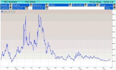
U.S. Bank CDS Rising, but Still Low
Last week, Rick wrote an entry describing how we’re watching closely for any signs of banking sector stress in Europe as they continue to wrestle with their debt crisis. We are also keeping close tabs on the U.S. financial sector, which is still one of the largest sectors in the S&P 500 Index despite all of the problems of the past few years.
Financials are the worst performing sector in the S&P so far this year, indicating that things still aren’t quite right there. The XLF Financial Sector ETF was off by -3.7% YTD through yesterday, while the S&P was up by 5.2%. And on Wednesday, which was a rough day for the market in general, Financials got hit especially hard as news broke that Goldman Sachs was dealt a subpoena under a new investigation into its mortgage securities business by the New York Attorney General. Investors may be rightfully wondering if the recent action in Financials is portending something ugly for the rest of the market, as it did in 2007.
While Financials’ equity market performance is troubling, the CDS market is telling a different story at the moment. CDS, or Credit Default Swaps, are used by hedge funds and other large investors essentially as a form of insurance. They purchase the contracts to hedge against the risk of default for specific companies. As the cost of CDS increases, it’s usually a negative signal that investors are suddenly clamoring for protection, driving the price higher.
The chart below shows an average of the CDS for 34 U.S. banks. The line has crept a bit higher recently along with general volatility in the financial markets. But, it’s still lower than where it started the year. Also, since the chart goes back a couple of years it offers some perspective, illustrating that bank CDS is still well below levels reached last year and during the financial crisis of 2008. In short, we aren’t seeing anything alarming at this point in banking CDS.

Thursday, June 2, 2011
Looking For Positive Data Points
We’ve been writing about a slowing growth profile for weeks, and yesterday brought more evidence that the economy has clearly entered a soft patch. We are currently scrubbing the weight of the evidence and puzzling through whether we believe this slowdown is transitory or here to stay.
But while the news flow is getting a bit more negative, it’s also a time to look for the other side of the argument, and make sure that we are not missing positive data points that are getting no coverage as the press jumps on the recent weakness in the numbers. One of the things I’ve been watching recently has been the resilience in the relative performance of emerging vs. domestic equity markets. As shown in the chart below, emerging market stocks have recently been gaining ground on U.S. stocks, which I’d take as an on the margin positive since they’ve been an engine for growth and are thought of as market leaders during this cycle.
There is clearly no reason right now to be complacent, and the recent outperformance by emerging markets could simply be a very short term counter trend rally that fails miserably in coming days. The point of this blog is that it’s always important to consider bullish and bearish points of view, particularly at times when the news flow starts tilting heavily in one direction.

Wednesday, June 1, 2011
10 Year Under 3%
So, in the short run, bond yields rising have proven to be anything but a sure bet. The chart below is a chart of the 10 year U.S. Treasury yield and the current yield has been pushed below 3%. The 3% level is a big psychological level on the 10 year as indicated by the yellow trend line in the chart. In 2008 and during the summer of 2010, the ten year broke below the 3% line as deflation fears spiked and investors ran to the Treasury market as a safe haven. And that break in the bond yield only marked the beginning of a vicious bond bull that would last for months.
The bond bull took yields down to 2% in 2008 and 2.3% in 2010 as indicated by the rising green trend line at the bottom of the chart. If this current break of 3% is a sign of further bond strength then we could see 2.5% on the ten year bond by the time it ends (the intersection of the yield and the rising green trend line). That would be a 15% drop in the yield and would be a significant gain in the Treasury market over the next few months.
At a time when our portfolio duration (price sensitivity to yield) is under benchmark, we have been mulling the bond market over for the past few weeks. We could use our small cash positions to purchase Treasury bonds, increasing our duration to try and protect portfolios during this slow growth patch; we could sit tight with our current allocation; or we could use this bond rally as an opportunity to further reduce duration in anticipation of stronger growth by the end of the year. We will soon be reaching a decision on this issue.

Subscribe to:
Posts (Atom)