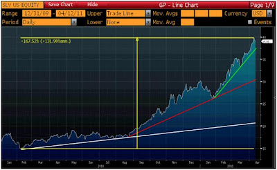
The chart below shows the price movement of silver (represented by SLV) over the last year and a half. The price has climbed from $15 a share in early February 2010 to over $40 a share yesterday which amounted to a gain of 167%. That move can actually be broken down in to three intermediate trends marked by the white, red and green lines on the chart below. As you move from the white line, to the red line, to the green line the slope of the lines becomes much steeper which indicates that the trend has been accelerating. This can also be called a parabolic rise in the price of silver.
A parabolic rise is certainly fun for an investor invested in that financial asset. However, parabolic rises usually mark the end of outperformance for that asset as investor euphoria settles down and no more buyers are left to drive the share price higher. This may or may not be the case for silver right now but it seems like a dangerous place if you are thinking about buying, especially with QE2 ending in June.


