Thursday, July 29, 2010

Unusually Uncertain

Last week in his testimony before the House Banking Committee, Federal Reserve Chairman Ben Bernanke testified that the economic outlook was “unusually uncertain.” Bernanke’s comment raises the question of what is the “usual” level of economic uncertainty. For example, in the days leading up to the financial catastrophe that struck Wall Street due to the mismanagement of subprime mortgages and related derivative products (among a host of other things), our Fed Chairman told us that the risks of subprime mortgage products were “contained.” I wonder what level of certainty he had when he told the nation about that particular forecast. It might have been helpful if he would have added that his view about subprime was “unusually uncertain.” The whole idea of certainty when it comes to active management of portfolios, or monetary policy if you are a Fed Chairman is something that I have often written about.

Pinnacle “grades” our investment forecasts from being high conviction forecasts to low conviction forecasts, which means we look at the world with varying degrees of uncertainty. I think there is a noticeable difference between our viewpoint, which is based on degrees of uncertainty, and an approach that is based on certainty. For us the financial landscape is always uncertain, and never certain. I believe that those who are certain of their investment conclusions are social misfits, idiot savants, or in most cases, just delusional to one degree or another. When we have the most conviction in our forecasts, meaning we are more certain of our outlook in an uncertain world, we are more likely to change the asset allocation of our portfolios to express whatever investment view we have at the time. We use our risk benchmarks as “home base” when evaluating portfolio construction and are likely to make bigger bets versus the risk benchmark. When we are feeling “unusually uncertain” about our forecast we are more likely to manage portfolio risk around the levels of volatility that our clients have already agreed to. In more practical terms, Pinnacle asset allocations will not get to 100% cash or 100% stocks, unless we arrive at such a high level of conviction in our forecast that we are certain of future market direction. It ain’t gonna happen.

I think the financial markets have been unusually uncertain ever since the bear market that ended in March of 2009. While we have enjoyed a cyclical bull market from the market lows of 666 to today’s S&P price of around 1100, I believe that economic and market forces have made it difficult to invest the bull or bear case with any kind of conviction for the past 16 months. Lately the “flash crash” and the European sovereign debt crisis have reminded investors that system risk in the financial markets remains high, and investors should invest with care. At the moment we have a relatively high conviction that we don’t want to be overexposed to risk in Pinnacle portfolios as we finish the summer and enter the historically volatile months of September and October. In the meantime, I appreciate Chairman Bernanke’s comments. Of course, our market outlook for the fall could change based on changes we see in the data. I suppose that means that our forecast is “usually uncertain.”

Wednesday, July 28, 2010

Double Dip Fears

I saw this chart a few weeks ago, although I cannot remember where, and brushed it aside. But I felt compelled to recreate it today after sifting through some sentiment indicators. Sentiment Indicators are used in technical analysis to gauge investor attitudes toward the market. They allow a market observer to quantify the level of optimism or pessimism in the market. The chart below is not a typical sentiment indicator; however, I think it accurately conveys the level of pessimism that is present in most retail investors today.

The chart is called a Google Insight, which is basically their label for searching searches. You can type in any word or phrase you want to see how many times it’s been searched using Google. In this case, I put in the phrase “Double Dip Recession.” You can see on the chart that the popularity of that search has skyrocketed over the last month, and in fact, it was the most searched phrase by the end of June. (To read the numbers, you divide the searches for your word by the searches for the most searched word. That percent is then graphed.)

The fear in the market was extremely high at the end of June based on these results. “Double dip recession” was used repeatedly by pundits in the financial media, and even we used it on a recent conference call with clients. And when the public ran with this fear, it proved to be a good opportunity to purchase stocks. The near term bottom in the stock market was July 1st, and since then the market has gained roughly 10%. This is a great example of how contrarian investing works.

Tuesday, July 27, 2010

EU Stress Test

The big news at the end of last week was the release of the results of the European Union’s “stress test” of its banking system. As it turned out, only 7 of the 91 financial institutions that were examined would “fail” under the adverse scenario used in the test, with an estimated capital shortfall of only about $4.5 billion. Overall, the results were much better than the market was expecting, although there was plenty of debate about the particulars of the test and whether it was “stressful” enough. Equity investors seemed pleased, with stocks rallying on the news and extending the bounce that began earlier this month.

While the stock market reaction was encouraging, we were more interested in the reaction in the interbank lending markets. 3-month EURIBOR (Euro Interbank Offered Rate) has continued to climb following the results of the test, signaling that banks are still distrustful of one another and so are increasing the rate they charge each other for short-term loans. If the banks themselves aren’t sold on the results of the test, that is very telling. So while we’d love to believe that the system risk fears in Europe are safely behind us, the behavior of the short-term funding markets warns that it would be premature to do so.

Chart: 3-month EURIBOR

Monday, July 26, 2010

Could Taxes Be a Bullish Catalyst?

Sunday’s headline in the Washington Post reads, “Battle looms on tax breaks,” “Bush-era cuts for rich at issue,” “Democrats see a chance to put GOP on the spot.” The story, by Lori Montgomery, explains the upcoming political showdown over tax cuts in some detail and points out that the politics of extending the Bush tax cuts are going to be part of a high stakes battle in the upcoming November elections. In general, Democrats see the issue as a positive where voters who have lost houses and jobs to “Wall Street greed” will be in favor of additional taxes on the wealthy. Republicans, who have been critical of deficits that they frame as being caused by Obama administration spending, would be hard pressed to explain why they don’t want to raise taxes on individuals earning more than $250,000 per year, thereby closing a $2 trillion dollar hole in the national debt over the next ten years. In opposition, Republican Orrin Hatch, the senior Republican on the Senate Finance Committee, says “They can talk about the wealthy all they want, but this is about stopping a job-killing tax hike on small businesses during tough economic times.”

The investment community has been focused on higher taxes for some time, and we have repeatedly written that higher taxes represent one of several structural headwinds to economic growth that will ultimately be a problem for earnings growth. While the article focuses on the differences in income tax rates for taxpayers, another issue facing the market is the increase in capital gains tax from 15% to 20% and the fact that Medicare taxes will increase the final cost to about 23%. In addition, dividends are going to be taxed at ordinary tax rates which can be as high as 39%, after being taxed at 15% under the Bush plan. The timing of the tax increases on January 1 of 2011 raises the real possibility that securities will be sold in the fourth quarter of this year in anticipation of tax increases on capital gains. This is not exactly “news” for investors and stock prices, at least theoretically, should have already discounted the selling pressures that are just over the horizon.

The “news” is that Democratic Senator, Max Baucus, the Finance Committee chairman, after a closed-door meeting with Finance Committee members from both parties, declined to rule out extending the cuts for the wealthy. The committee, he said, will “figure out what we think is best.” Democratic Senator Kent Conrad, a Finance Committee member who also chairs the Budget Committee, said he would prefer to extend all the tax cuts, at least until the economy fully recovers. My guess is that the possibility of extending the Bush tax cuts is not “in the market.” If the economy remains weak the argument to extend the current tax regime could become more attractive to Democrats who are already under fire for the current high unemployment rate. If the tax cuts become a debate about jobs and not about deficits, and if they do get extended, I think it would be extremely bullish for risk markets.

Friday, July 23, 2010

Utilities Catching a Bid

Not surprisingly, defensive market sectors have generally outperformed since the latest bout of market volatility hit in late April. Through yesterday, many cyclical sectors are down by double-digits since then; the S&P 500 is still down by about -10% from its high on 4/23. Meanwhile, defensive sectors like Consumer Staples and Telecom are only down a few percent. But Utilities are the big winners, up about a half a percent since the market made its high. In fact, it’s the only S&P sector with a positive gain since then.

It’s hard to pinpoint exactly why Utilities have been outperforming. The obvious answer is simply that investors are growing more cautious and are rotating to less cyclical market sectors to reflect that. But there may be other factors at work also. For instance, the current dividend yield on Utilities sector ETFs is more than 4%, which compares very favorably to the 10-year Treasury bond that has fallen back below 3%. It’s one of the larger differences between the two in the past few decades. In a yield-starved, volatile environment, Utilities just may be finding a sweet spot.

Chart: Utilities Sector ETF (red) vs. S&P 500 ETF (blue), with relative strength line (green)

Wednesday, July 21, 2010

System Risk Ebbing, For Now

One of the differences between the latest correction and previous market setbacks in this bull market has been the return of system risk. Many of the system risk indicators we follow are bond market relationships and we have written about them in this blog from time to time. One of those measures is called the TED Spread. The TED spread is the price difference between U.S. T-bill futures contract and Eurodollar futures for an identical expiration. It is used as a credit risk indicator since the market currently deems T-bills to be “risk free,” while the Eurodollar market is assumed to be more like corporate credit due to the less stringent regulatory environment overseas.

During the height of the current correction the TED spread was rising as European banks came under pressure, causing fresh strains in the interbank lending market. More recently, it is encouraging to see the TED spread drifting lower, along with a decline in the price of credit default swaps and corporate spreads in general. Risks are not all equal, and the risk of another banking freeze is not to be ignored. For now, there are some positive signs that things are calming somewhat in credit markets. But this pause is a not a guarantee that credit flare ups are over, and we’ll have to keep a very close eye on the TED spread and other measures of system risk over the coming weeks and months ahead.

Chart: 6-month TED spread (source: Bloomberg)

Tuesday, July 20, 2010

Bullish Engulfing Pattern

With the disappointing IBM and Texas Instrument earnings announcements last night, the S&P 500 opened sharply lower this morning. It seems that the market is now very concerned with companies that miss revenue targets and we could be setting a theme for this quarter’s earnings. However, as we returned to the office after a gorge fest at the local Chinese restaurant, the S&P 500 had completely erased all losses and rallied throughout the remainder of the session. Why? I don’t know, maybe rumors on the Fed stopping interest payments on excess reserves or leaks of Apple’s great earnings. Whatever the reason the market action today created a nice bullish trading pattern called the engulfing pattern (which in no way relates to our lunch habits).

The Bullish Engulfing Pattern is basically a period of market movement (one day in this case) that opens below the previous market movement (yesterday) low, and closes above the previous market movement high. And although technically speaking yesterday should have been a down day this still seems to be a good signal for the bulls especially after the sharp sell-off on Friday. The chart below shows the S&P 500 over the last three months. At the very far right of the chart you can see the last green line has completely covered the green line to its left. Or it seems to ‘engulf’ Monday’s price movement. This signals that the bulls have taken control of the price action and might be the end of the short-term decline.

Also, note that the blue line on the chart is the 50 Day Moving Average. That seems to be the next resistance zone as prices could not move above that moving average in early May, mid-June and last week. It also coincides with the downtrend line Carl mentioned last week. These longer term trends are where we focus our attention but the day to day activity in the market is interesting to note because the market may be giving us hints.

Monday, July 19, 2010

Canned Goods, Bottled Water, and Shotguns

System risk, or the risk that the entire financial system will cease to work, is on the minds of many of our clients who invest with the intention of preserving capital and earning enough of a premium over inflation to achieve their financial goals. Rick and Carl mention worries about system risk in our current market review and serious analysts keep a close watch on risk spreads as early warning signals that another “2008-like” episode may reappear. That’s why the July Gloom, Boom, and Doom Report by Marc Faber caught my eye this weekend. We value Faber for his contrarian views, his highly intelligent analysis, and his multi-national view of global finance. As you might expect from the title of his newsletter, Faber is famously bearish on the long-term state of the financial markets. This month he reports on a discussion he was invited to participate in that included other well known and highly respected bearish analysts – Gary Shilling, David Rosenberg, and Nouriel Roubini. With these four guys in the room I hope there weren’t any sharp objects around for listeners to put themselves out of their misery. These analysts are not “wacko” bearish, but highly intelligent bearish...the kind of bearishness that you have to take seriously.

What caught my attention was that for all of the discussion about double-dip recessions and stock market declines back to the old lows of 666 on the S&P 500 Index or lower, there was no discussion of the financial world coming to an end. Most system risk discussions nowadays are split between the camp that says in a massive deflationary spiral interest rates go to zero and paper money becomes worthless as governments are forced to default on their debt, or the deflation will cause governments to attempt to wildly inflate assets in an attempt to not default on their debt, thereby causing paper money to become worthless. In both scenarios, worthless is the operative word. In our worst fears, where everything goes up in smoke in a one day crash of historic proportions, I always tell clients to make certain they have plenty of canned goods, bottled water, and a shotgun. Fortunately, our bearish foursome had perhaps more helpful ideas. In the deflationary scenario (Shiller, Rosenberg, Roubini) investors should overweight bonds in their portfolio. In the hyper-inflation scenario (Faber) investors should own hard assets and cash and diversify the custody of their assets around the world.

The most self-proclaimed bear of the group is Faber, and he offers up his asset allocation for investors who want to preserve wealth in such turbulent times. He recommends: equities: 20-30%, real estate: 20–30%, corporate bonds of different maturities: 20-30%, precious metals: 20-30%, and cash: 20-30%. If you squint your eyes a little bit, this allocation looks similar to Pinnacle’s portfolio asset allocations for conservative and moderate growth investors. We would take issue with the real estate allocation, and quibble with corporate versus higher quality debt, and even with the difference between short-term debt and cash, but the main idea is similar. Be diversified. Own a variety of asset classes. Stay away from leverage. Give yourself a short but reasonable time horizon to recover (three years or longer). I hope our most worried clients will note: None of these famously bearish commentators thought it necessary to load up on canned goods, bottled water, and shotguns as part of their asset allocation.

Friday, July 16, 2010

Inflation Pressures Fading

This week’s barrage of economic data included several updates on the inflation front. Separate reports on import prices, producer prices, and consumer prices were all released. Import prices and producer prices came in below expectations, while consumer prices matched expectations by declining a little from the prior month. The current message from the latest round of data seems to be that inflation pressures that briefly sprung up earlier this year are rapidly fading.

The bigger issue, of course, is which of the two forces, inflation or deflation, is more likely going forward, since they have very different invesment implications. There continues to be a hotly contested debate in the market place about that right now. We continue to believe that both camps make valid arguments, and there’s a possibility that both may be right. The issue for us has to do with timeframes.

With the economy clearly showing signs of slowing recently, and still dealing with the aftermath of the deep 2007-08 downturn, we tend to lean toward the disinflation/deflation camp in the near-term. However, we also believe that inflation may eventually appear as an eventual side effect of the ultra-easy policies that policy makers have pursued for the last year and a half.

Chart: CPI year-over-year % change (blue) and PPI year-over-year % change (red)

Thursday, July 15, 2010

Market Update

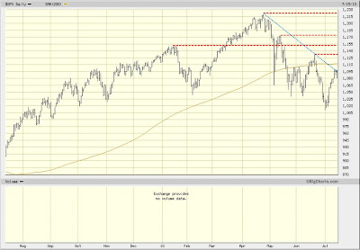
The S&P 500 has bounced over the past several trading days, gaining a little more than 8% from its intraday low of 1,011 reached on July 1st through its close at 1,096 today. The latest move isn’t totally surprising, since the market was oversold on many measures at its recent low. However, technical damage was incurred on the way down, and we now see several levels of resistance that the market must make its way through before the overall picture begins to improve.

The first hurdle ahead is the flattening 200-day moving average (brownish line on chart) at 1,112, which is just 1.5% higher than today’s close. Next up is the June 21st intraday high of 1,131, which is about 3% higher. After that is the January 19th high at 1,150, a 5% move higher. Then there’s the May 13th post-flash crash bounce high of 1,173, which is 7% up from here. Finally, the recent rally high of 1,220 reached on April 26th looms, which is about 11% higher. In addition, the market currently appears to be trying to break through the down-sloping trend line that connects the April and June highs, which would be the first sign of progress if accomplished.

In short, from a technical perspective, we see multiple levels of resistance that the market must work through before regaining the upper hand and possibly resuming the rally that began 15 months ago. Despite the recent bounce, we are not out of the woods yet.

Chart: S&P 500 with downtrend line (blue) and resistance levels (red)

Tuesday, July 13, 2010

The Big Short, Inside the Doomsday Machine – A Book Review

The latest book on my summer reading list is The Big Short, Inside the Doomsday Machine, Michael Lewis’s amazing book about the hedge fund investors who managed to find a way to bet against the U.S. subprime mortgage market before it blew up in spectacular fashion. If you are looking for a book that simplifies and explains many of the derivative mortgage products that are now part of the vocabulary of any investor, then this is the book for you. Part of Lewis’s genius as a storyteller is his ability to explain complicated financial stuff, and this book doesn’t disappoint. If you’ve had a secret longing (come on…admit it) to understand Residential Mortgage Backed Securities (RMBS), Credit Default Swaps (CDS), Collateralized Debt Obligations (CDOs), synthetic CDOs, etc., this is a way to learn by being engrossed in a fantastic story about compelling people.

What is the real story of the book? For me it is a story of the type of investors who are true value investors. These are people who look at the world in a different way and have the ability to disagree with the consensus. In this case, the hedge fund managers that Lewis introduces us to basically reach the conclusion that the consensus is wrong about U.S. residential real estate, the U.S. mortgage origination and distribution system of underwriting mortgages, the level of risk in mortgage-backed securities and their derivatives, and the entire Wall Street apparatus of the world’s largest investment banks who ultimately packaged and sold hundreds of billions of dollars worth of subprime and Alt-A mortgages. In short, these hedge fund managers reached the conclusion that they were right, and virtually everyone else was wrong about the state of finance around the world. Not only do they reach the most amazing contrary opinion of the century, but they then risk everything they own to invest their view. I suppose when you can buy insurance on subprime mortgages (a way to sell-short or bet against the value of the mortgages) for 3 cents on the dollar, the value characteristics of the trade seemed obvious…to them.

And what is the defining characteristic of these genius hedge fund managers who bet it all and made hundreds of millions of dollars when the U.S. residential real estate market fell in value and the underlying mortgage products imploded? They were social misfits. One was eventually diagnosed with Asperger’s disease, although he attributed his inability to get along with people to having a glass eye. Here is Mike Burry, one of the heroes of the book, describing his struggles to get along with people: “When trying his best he was often at his worst. ‘My compliments tended not to come out right,’” he said. “I learned early on that if you compliment somebody it’ll come out wrong. For your size, you look good. That’s a really nice dress: it looks homemade.” Burry is one of many characters that are so socially inept that apparently their only recourse was to lose themselves in finance. I never thought that I would meet such interesting characters in a book about the subprime mortgage market, but there is a lot to learn from them if you aspire to be a value investor, or want to better understand value investing. This is a great book that’s easy to read. If you have some time left this summer, take a shot at it. Next on my reading list: This Time its Different, Eight Centuries of Financial Folly, by Carmen Reinhart and Kenneth Rogoff.

Friday, July 9, 2010

Leading Indicator Update

It’s Friday and the sun is shining bright, so here are some charts to analyze. Rick and Carl are writing the quarterly outlook which will provide more color on the charts, but the basic gist is leading indices are signaling a slowdown ahead.
ECRI Weekly Leading Indices
Baltic Dry Index
Dr. Copper
Will the market follow the signs? It's never that easy!

Thursday, July 8, 2010

Death Cross

Last June, every financial station on TV heralded the Golden Cross. This is the term that describes the 50 Day Moving Average, which is the average price of the last 50 closing prices of a security or index, crossing above the 200 Day Moving Average. That was a good moment for bulls because it is one indicator that suggests that the market has confirmed a new bull trend. Well, one year later, the opposite cross has occurred – the Death Cross. The 50 Day Moving Average of the S&P 500 has crossed below the 200 Day Moving Average. In the snapshot below, the 50 Day MA is in green and the 200 Day MA is in yellow.

The Death Cross signals that another change in trend, from a bull market to a bear market, may be taking place. And although the cross by itself is not a very powerful trading tool, it is one more piece of the technical puzzle that is lining up in favor of a bear market. The markets are tracing out a pattern of lower highs and lower lows since the peak in April. An important technical stop has been breached with a close below 1040 on the index. The close below 1040 also completed the head and shoulders pattern Rick mentioned two weeks ago (although the neckline did not hold with the last two day rally).

The next significant piece will be the slope of the 200 Day MA. Currently the line is barely rising, although for intents and purposes it has flat lined. When the slope turns negative this would confirm the cross, and signal low returns for the index. Ned Davis, which is an incredibly great independent research service, studied the slope and determined that the gain per annum when the 200 day MA is falling is a mere .2%. This is compared to a 7.5% gain when the slope is rising. The bulls need to get going to undue this damage.

Wednesday, July 7, 2010

How Important is Harry Markowitz to the Financial Planning Industry?

Last Thursday, Donna Mitchell, a writer for Financial Planning Magazine, interviewed me for about a half an hour about the importance of Harry Markowitz. For those of you who haven’t read my book (oh…the shame of it), Markowitz is the author of the Nobel Prize winning paper, Portfolio Selection, published in 1952. His paper is the foundation for a body of work now known as Modern Portfolio Theory, which is central to how modern institutional portfolios are constructed. Not knowing what I said in the interview, and certainly not knowing what will end up in print, here is what I hope, or wish, or think, I said (or should have said) about Markowitz.

The late Nobel Prize winner, Merton Miller, called Markowitz the “big bang” of modern finance. His description accurately describes the importance of Markowitz, even if it does falsely imply that Markowitz did not build on the work of other academics before him. (I believe that Louis Bachelier deserves the title of “father of modern finance” for his work on quantitative option pricing as a graduate student in France in 1900.) The name of Markowitz’s paper, Portfolio Selection, does much to describe how his work contrasted with the prior “value investing” methodology popularized by Benjamin Graham in his 1934 work, Security Analysis. The titles say it all…Markowitz introduced us to quantitatively building portfolios, as opposed to evaluating individual securities. His algorithm for building portfolios was elegant and easy to understand. With three inputs, future returns (mean returns), future volatility (future variances), and future correlations, you can build the most “efficient” portfolio, a portfolio that generates the most return for the minimum amount of risk. This notion of efficient or optimal portfolios based on means/variance optimization is central to everything financial planners are taught in terms of portfolio construction.

My issue is not with Markowitz, who deserves the acclaim he now receives, but with the industry that has misinterpreted and misrepresented his work. Instead of using forecasts of future means and variances to run his model, the industry found a way to use the historical average of returns and volatility as inputs to the model. The result can be dangerously misleading. The way Markowitz’s model is used today investors may believe that diversifying their holdings is the best and only method to manage portfolio risk. As we have repeatedly said, if assets are overvalued then diversification may not help to manage risk at all. If I have any beef with Markowitz it is in the notion that volatility (variance) is the best measure of risk. Most value investors cherish volatility and view it as a means to manage risk. Value investors would say a much better way to view risk is simply the probability of losing your money. Downside volatility in price allows value investors to buy assets at discounts to their intrinsic value. This allows for a “margin of safety” that actually reduces risk. Harry Markowitz published his paper in 1952. He is an iconic figure in our business that deserves our greatest respect. I hope that any comments I made to Donna last Thursday reflect that sentiment.

Tuesday, July 6, 2010

My Morning on the Trading Desk

As CIO of the firm, I tend to think of investment strategy and tactics when explaining our investment process from the 30,000 feet up perspective. The day-to-day trading operations of the firm go by me in blissful ignorance. However, last Friday I found myself staring at the CyberTrader screen at 7:30 in the morning watching the market wake up for the trading day. It turns out that Pinnacle needed to buy 400,000 shares of a security to close out a trade, and while the gory details of the transaction are not important, what matters is that we needed the shares of exchange-trade fund XLK to fall during the trading day. Senior Analyst Carl Noble was explaining how little activity there was in pre-market trading in the shares, and we could literally see the few offers to buy or sell the security from around the world show up on the screen as the minutes passed.

Complicating matters for us was the fact that the monthly payrolls report was due out that morning at 8:30 a.m., a full half hour before trading opened. We consider the market to be oversold in the very short-term as we’ve seen a couple of weeks of relentless selling. On Friday morning we were thinking was that any decent payrolls report could ignite a sharp early morning rally – the absolute opposite of what we were hoping for. Further complicating matters was that Friday was the last trading day prior to the July Fourth holiday weekend, and traders would be jumpy about short positions they held through the weekend if the payroll news was good, or simply better than expected. If the number beat the “whisper number,” the unofficial expected payroll number, then we could be under water. The payrolls report was announced at 8:30 a.m., and the report was rather benign. The offers to buy and sell began to pick up momentum and you could see the bid–ask spread begin to narrow as volume picked up. Tick…up…tick…up….tick…down….the numbers rolled up the screen at an increasing pace as we got nearer to the market open.

I thought of my next door neighbor, Chris, who is an energy trader for Constellation Energy. Could this insane exercise be what he does for a living on a daily basis? Tick…tick….tick… The market drops down a few points and Carl, working with Scott on the Schwab trading desk, who is working with UBS, who actually makes a market in the ETFs, buys 150,000 shares. Now I’m thinking of Eddie Murphy’s famous scene in the movie Trading Places where he is trading commodities and explaining that investors were panicking because they needed to get home and buy their kids the GI Joe with the kung fu grip. (We decide to take another 150,000 shares.) It turns out the commodities traders in the movie were dealing with the Christmas holiday rather than July Fourth, but now I can feel their pain in a completely different way. Tick…tick…tick…. The market is open now and the spreads are collapsing. Millions of shares are being traded while I watch the screen. It’s 10:30 a.m. and we are out of the trade. To Sean Dillon and Tim Mascari, our portfolio traders at Pinnacle, I thank you for what you do for us every day. This is absolutely nuts!